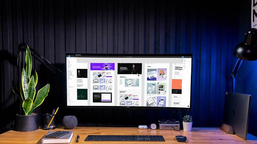
So, when you are designing your UI, you have to ensure you are applying the right colors and fonts. Just as with any part of the brand, you can’t afford to select the colors and fonts on a whim.
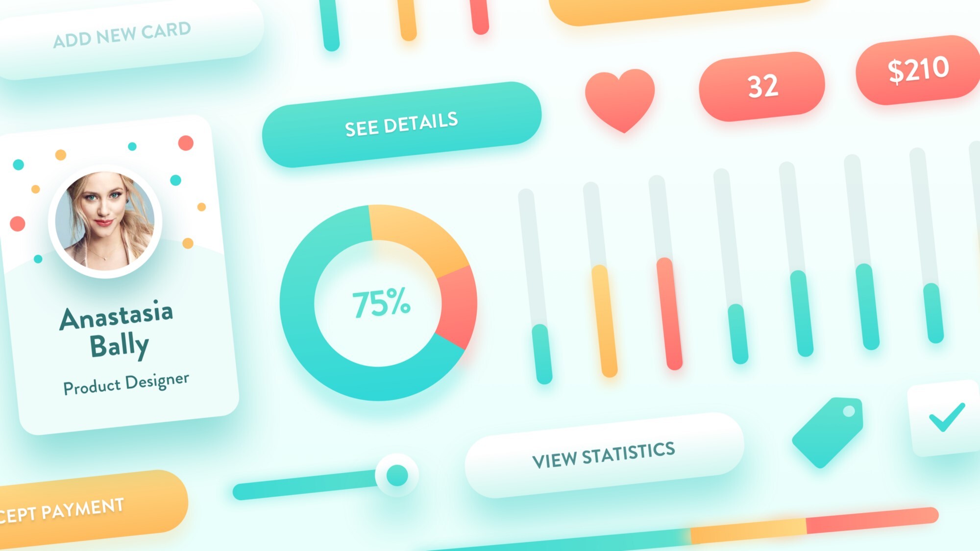
How your visitors react when they visit your website is in your hands. Surely, you don’t want your visitors to have a poor first impression. And, the two primary factors that play a significant role in the success of UI design are font and color.
Here is how fonts and colors can make your UI stand out,
1. Improves Readability
Readability is the primary factor that UI/UX designers consider when applying colors and choosing fonts. Your visitors should be able to read the website content without any hassle. Ensuring readability is the key to presentation.
The font and color add value to the text. It helps the visitors perceive important details from the text. So, the right font and color can be important for attracting your target customers.
2. Enhances Intuitive Interaction and Sharpens Navigation

Visual hierarchy is vital for intuitive and clear navigation. UI elements are organized in a manner so that our brain is able to identify elements by analyzing their physical differences, such as colors. They have their own hierarchy that is defined by the impact’s power on the user’s mind. You will find bold colors, such as orange and red, and also mild ones, such as cream and white.
Users easily notice all bright colors. When you apply a single color to various elements, it shows they are connected. For instance, you can use red color to denote the purchase button. Hence, people can easily locate it.
Using the right color can enhance the navigation experience for the users.
3. Holds User’s Attention

Sure, you can attract potential customers using typography. But you need to be more creative with the colors and fonts. So, you can use some bright colors to highlight the texts that are captivating.
Every content might come with some mundane text. But if you use the appropriate color and font, you can make them appear attractive.
4. Creates Harmony
When you design your UI using some colors and font and then use the same pattern throughout the presentation, it brings everything together. Harmony is the top feature in UI design. It can give an artistic effect to the website. Using the same font and color for similar content offers continuity. The proper alignment of fonts in the right proportion can make your UI look uncluttered.
5. Exudes Professionalism
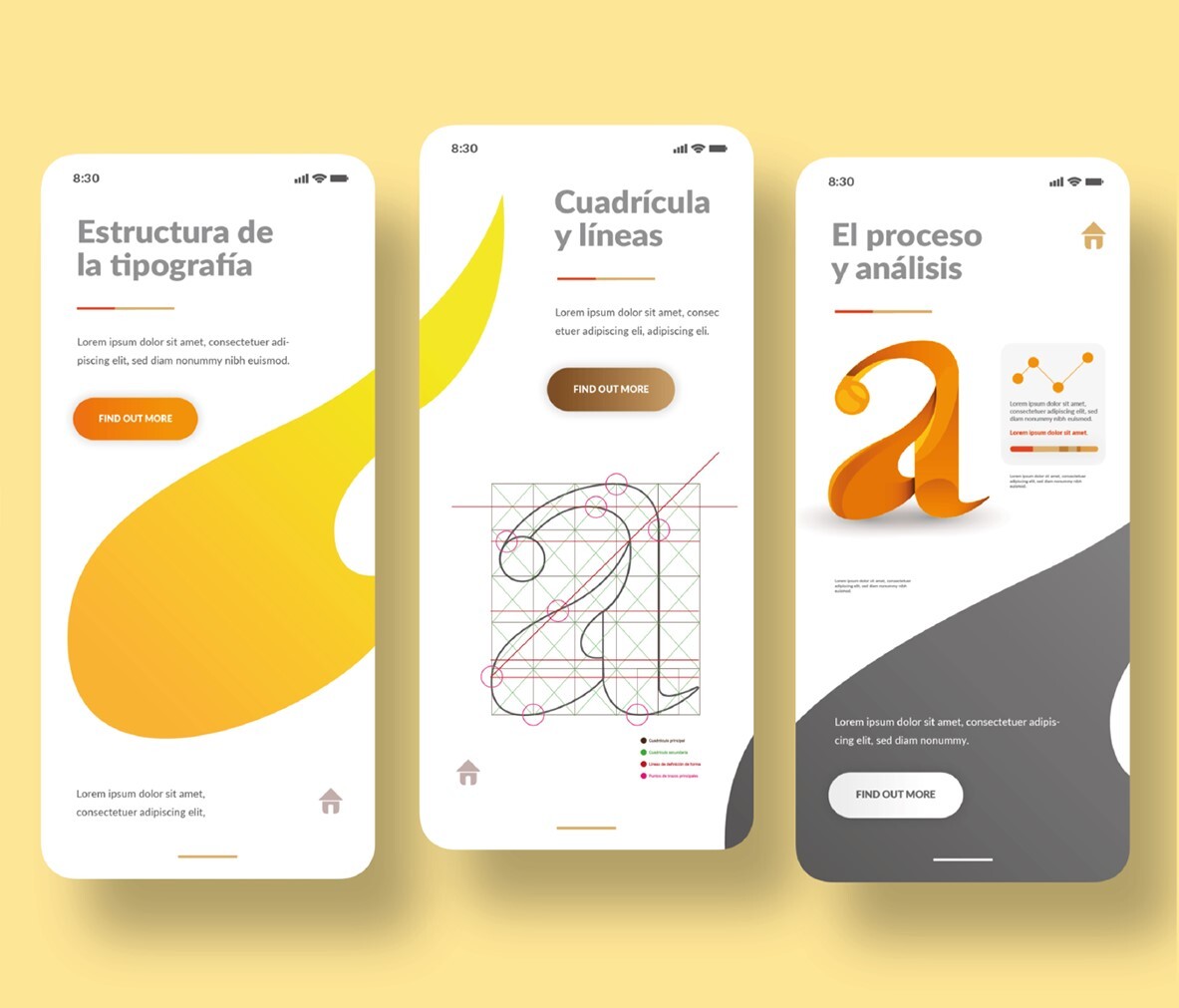
The right addition of typography in UI design reflects your professionalism. Using the right font and size in the right color will help in gaining the customer’s trust. It benefits your product marketing if is it a business-based website.
UI design’s professional approach includes font and color at its core. It defines the importance of the content you offer and the customer feeling secure about the information they get.
6. Sets the Mood
For conveying the right tone and calling the users to take the expected action, UI designers should that colors have an influence on a person’s mood and behavior. You should know that our mind reacts to colors. Whenever our eyes perceive color, our brain signals the endocrine system to release hormones that are responsible for change in the emotions.
So, the right color in the right font will help in putting users in a frame of mind that will push them to take the required action.
For instance, if you create a UI of a product that is connected to gardening or nature, it is highly likely that you will find it in a blue or green color palette. This ensures that the design is associated with a kind of a product or service from the very beginning.
7. Gives the UI a Trendy Look and Style
Bold and bright colors are trendy in UI design. When used, they bring a feel of modernized technology. A website or app designed as per the latest trend looks trendy and attractive. This draws more users to the website, regardless of higher competition.
Bottom Line
When you use the right font and color for your site with some rhythm, it can add great value to the brand. Keep in mind that your audience is always going to remember the font and color you used to present the visuals. It works as an identification for the viewer so make sure you make them look attractive.
