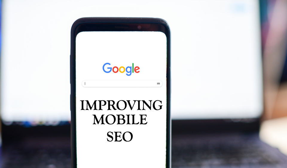
Over 70% of internet users access the web through their mobile devices. That means if your site is not mobile-friendly, it will be difficult to optimize your website for search engines. A mobile-friendly website helps users to navigate through your site easily and quickly without any stress.
When your site is mobile-friendly, it loads correctly on mobile devices, and content is presented in a readable format without any need to zoom or pinch. If a user finds your site easy to navigate through, you can be sure of an increased optimization for your site. In this post, we will look at helpful tips on how to improve mobile SEO for your WordPress website.
Why Focus on Mobile SEO
So, why is mobile SEO so important for your WordPress website? Well, for a start, Google uses a site’s mobile version to determine its ranking. If your WordPress website is not optimized for mobile or if the content is presented on mobile in an unfriendly way, it will be difficult for your site to get good rankings.
Therefore, if you do not have a good-enough mobile representation of your website, it is highly recommended that you make it more functional. You should consider choosing a responsive design.
While working to build your mobile site, you should not make the error of creating a distinct site from your desktop website. Your site is one. You only need to adapt the design to incorporate viewing on different screens.
Best Tips to Improve Mobile SEO for WordPress Website
Now that you understand why mobile SEO is important, the next thing is to know how to do it. How can you make your site mobile-friendly to significantly improve search engine optimization? Here are the top tips to consider to enable you to achieve your objectives.
• Evaluate your Mobile Site
This should be the first thing you should do. Perform a mobile usability test of your website on Google before you begin to work on the mobile SEO for your WordPress site. This will let you know your current status before you start any work. You should continue to test while working on your mobile SEO to see if you are making any progress.
If you notice any progress, your mobile site is getting optimized and you should be proud of it. However, you should not stop there. You have to tell Google about your site to get indexed. You should leverage Google Search Console to monitor and maintain your site performance.
• Focus on Exceptional User Experience
When visitors find your site easy and seamless to navigate, they stay long to interact with your site’s content. It may interest you to know that Google also notices when visitors stay longer on your site. So, how do you make the user experience on your site exceptional?
First, get a clear idea of what visitors look for when they are on your site and what they do while exploring your site. Are they doing what you want them to do or you would rather they do something else? If you want your site visitors to call you, then make your phone number conspicuous enough for them to see.
If you want them to buy your product, make the buy button functional and outstanding. Guide your users through your site nicely and give them an enjoyable experience by making it easy for them to locate what they want. Of course, you may not get it the first time. So, develop, test, improve, test again, and have your mobile site fully optimized.
• Opt for a Responsive WordPress Website Design
Responsible design is crucial to your site’s functionality and ranking. Google ardently supports the responsible design and it is one of the top factors that will improve your ranking in search results. Your site is situated in a single URL when you use a responsive design. This makes it seamless for Google to understand what your site is about and index it.
WordPress themes are generally responsive and you can adapt them to different screens. However, it is recommended that you use Google Chrome’s Developer Tools to check the scaling of your site. If your site does not scale appropriately, you should consider fixing or changing the theme.
• Reduce the Code
The requests that your site makes affect its speed. That means you have to minimize these requests. You can reduce the requests when you minify the code. What does this mean? It means that you concatenate and group assets, such as CSS and JavaScript to enable the browser to load fewer files. This will in turn increase the loading speed of your site. You can use a plugin to get this done without any stress.
• Minimize Redirects
A redirect directs visitors from a requested page to another because the requested page has been deleted or moved. Redirects are undoubtedly great for a good user experience when done correctly. However, when you have more than necessary redirects, your site will get slower and visitors get frustrated about your site.
This leads to more bounce rates and ultimately affects your ranking. Therefore, avoid making numerous redirects. When using internal links, make sure you use links to new posts and not deleted ones. It is recommended that you make direct links instead of redirecting.
• Use Browser Caching
When you use browser caching, you tell the browser that it can save page elements that rarely change in its cache. With this, the browser only downloads dynamic content when it visits your site again. You can do this manually if you have the skills and you can choose to use a plugin to get it done.
• Do not block CSS, HTML, JavaScript, and other such Assets
You should never block assets, such as CSS, HTML, and JavaScript on your site. When you do, it becomes difficult for Google to access your website. This will result in a bad ranking and you sure do not want that. You should open your Google Search Console to check if you already blocked these resources. Ensure you remove all restrictions to these assets if you want to optimize your mobile website.
• Explore Google Accelerated Mobile Pages (AMP)
AMP is a search engine initiative to make web pages load faster on mobile devices. When you build your content around special HTML code, you can significantly optimize your web pages in such a way that it makes it easy for Google to give them preferential treatment.
Google cached such web pages and present them nicely and deliver them at a faster speed. It is recommended that you incorporate AMP into your toolkit as your WordPress website will benefit significantly from it.
• Improve Legibility
This may seem like something every site owner or web designer should know but you never can be too sure when it comes to a mobile site. Test your site and make sure that it is perfectly legible on mobile devices.
It is recommended that you use different screens to check the typography of your site to see if it is in order. If necessary, you should make changes to it. It is important to know that typography has a lot of impact on your site’s user experience.
Conclusion
Mobile is the in-thing in website exploration. If your website is not mobile optimized, you cannot get good ranking with Google and other search engines. Therefore, make sure to do everything possible to get your mobile website up and running.
When your site visitors are happy with your website, Google will too and the result is a well-optimized website ready for a good ranking on search engine page results.