Compared to all other elements like WordPress color schemes, theme, images, backgrounds, and blog layouts, thinking about the fonts may seem rather insignificant.
The truth is all website owners should focus on WordPress fonts as they play a huge role in your site’s design and readability.
Also, choosing the correct font can help your online presence stand out among competition, increase brand awareness and boost your conversions.
All of this is possible only if you do it right. In this guide we will help you choose the best font for your website and dive into details about the specification of each one.
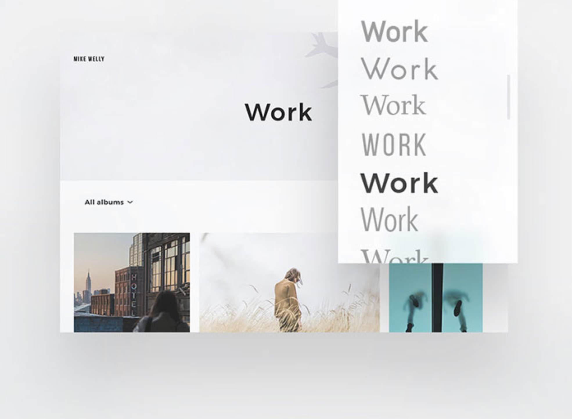
Which are the most common Font styles?
The fonts on your site say a lot to users about who your brand is. Even a small change can alter visitors’ perception of your company.
Bellow you can see some of the most popular font style choices:
- Script
What is interesting about Script fonts is their fancy and curved design, which mimics handwriting. They have two main categories: casual and formal.
Casual scripts are more like modern calligraphy, and will never go out of style. They are most used for designing logos with larger font sizes as they can be difficult to read in larger quantities.
Formal scripts are very fancy and luxurious. They show you in details the work of handwriting masters of the 17th and 18thcenturies. It’s notable to mentioned, they come with over the top curls and swashes which extend beyond every character.
- Display

Display fonts are every creative person’s dream: they are fun, eccentric and quirky. Each of them has their own personality which immediately grabs the users’ attention.
They become popular during the 19th century when used on vintage posters, billboards, or pamphlets. You may notice, that many display fonts like Rockwell for example, come with a type of swooshes which extend beyond after each character and are thick and blocky looking.
These types of fonts don’t have a good readability online which is why they are used for major announcements or headers.
- Modern

A very typical quality for modern fonts is that they are very structured. They have a very professional design and sometimes can have a more gold and business like feel to them. A lot of modern fonts come with thin, long serifs which extend beyond the ends of the characters.
In addition, because modern fonts tend to stress the vertical position, they have no slants. You will also notice they can vary regarding the thickness throughout each letter, which adds a certain class and style without ruining the design.
They are best used for large-sized body text or headlines.
- Serif

Famous with the fact that they are the most traditional ones, Serif fonts come with simple markings, which are called serifs and extend beyond the end of each character. This is the most conservative of the font styles, which also makes it a trusted choice.
The most common serif fonts, like Times New Roman, appear mainly in printed materials. Although a lot of people choose this font style for their website, we don’t recommend it as it can be very difficult to read, especially when there is a lot of text. It can be very useful for large headings or logos, for example.
- Sans Serif
These types of fonts are mostly found online. They are modern looking and fresh, and also lack the serifs which extend beyond the end of each character. The lack of serifs is exactly the reason this font style is so popular online as it doesn’t bother the eyes.
This font style was most popular in the flashy and stylish 30’s. A lot of people even think this font style should only be used in advertising since it is not appropriate for other materials.
Today, however, serif fonts such as Helvetica are seen almost everywhere.
Why is the Font choice important?
The ideal typography is very important and has a lot of meaning behind it. Elements like grid, visual hierarchy, whitespace all matter. If your font is not the right one for your website, none of the other things matter.
- Font choice plays a vital role to the user experience and website design.
- It increases brand awareness and provides you with the opportunity to show a personal touch.
- Ensures the visibility and readability of your content.
- Establishes content hierarchy, especially regarding blog posts.
- Makes your brand more professional looking.
- Guides your visitors with ease through your content.
As you see these is so much to font style than looking good. It can have a large impact on your online presence and shape the way people view your brand.
Most popular Fonts for WordPress
Noto Sans

If you have a multi-language site this is a great option to maintain the same font on all versions. This font supports no less than 30 scripts, while planning to add Unicode to the list as well.
You have the options for Regular, Bold, Italic, and combination styles.
Roboto

If you are more into modern styles, then this is the font for you. It’s mainly based on interesting curves and geometric shapes, and looks good on both titles and body content. This helps making it versatile and adaptable for different case scenarios.
You can also combine with other fonts. It comes in a condensed version, called Roboto condensed, which gained a lot of popularity among WordPress users.
Mina

As per official data around 1000 websites today use Mina. According to the Google API system, this font was displayed no less than 180 000 times during the past few weeks. This speaks volumes with how happy are users with the readability of this font.
Open Sans

If you are a fan of Sans-Serif fonts, Open Sans will go nicely with your style. Even Google colossus uses this font on some of its websites, and you can even see it on printed materials.
This is one of the simplest, cleanest font choices available and can be used for multiple purposes – mobile interfaces, websites, print materials and much more.
Playfair Display

Despite appearing for the first time in 2013, today this font is still going strong. If you are in need of an extra-large font, this will do the job nicely.
The design is entirely inspired by the 18th century printing technology. It’s very similar to the Shakespeare and Baskerville fonts. For maximum impact, use it only for headlines and titles.
BеnchNine

This is your best option if you have a blog with a more vintage look. It borrows some design tips from the vernacular woodcut type and ink bleeds. It’s mostly a combination between Stephenson Blake fonts and font with more rounded corners.
Slabo

If you are interested in trying a WordPress font designed for a certain size, then this is your chance. It’s great for both headlines and content, depending on what you need.
Lato
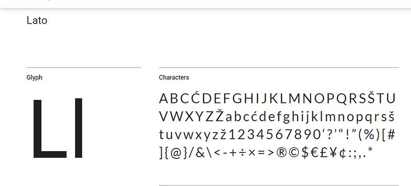
This one is a huge hit in the US – no less and 8 billion displays as per the Google API. Lato, meaning “summer” in Polish, is a 2010 developed Sans-Serif font. Due to its elegance and simplicity, the font is still a very popular choice, suitable for all websites.
Oswald

In a world where we spend most of our day in front of a device, Oswald brings back the old historian writing style. Keep in mind, in terms if letter spacing, this font is smaller.
Lora

Lora is placed among the top places for best WordPress fonts for modern looking websites. Inspired by the curviness of calligraphy, the font is great for body-text, but can be used in a combination for headings also.
Lora is a memorable font which would look great on storytelling artistic websites.
Monserrat

You have most likely seen Monserrat around, as it’s a popular font with all types of purposes. It’s very suitable for professional websites who want to keep their design clean and simple, as well as easy to read. Around 5 billion websites around the world are currently using it.
For a more interesting look, you can combine it with Lato or Open Sans.
Source Sans Pro

Developed by Adobe, this is one of the best WordPress fonts suitable for all user interfaces. Since its release its been used on over 4 billion sites in France in the US alone. A lot of users prefer to combine it with Oswald or Roboto.
Conclusion
Choosing the font for your WordPress site is simply the first step. You need to learn how to use them so they match your style and brand, as well as how to achieve the proper effect. The fonts you choose will convey a certain message to your visitors and in the end, convince them to stick around and read your content.
Which are your favorite font combinations and styles? Share with us in the comments bellow.