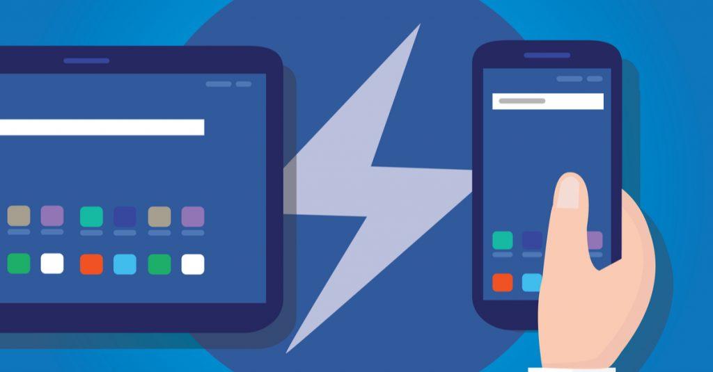
Having a responsive as well as optimized mobile version of your website is a must in today’s smartphone world, where a large percent of the people will find your content online using their smart device.
So what do you do if you want your WordPress website to be optimized for mobile devices? As most things with WordPress - you install a plugin for it. But before going further let’s talk about why is this important.
Why is the speed important for mobile devices?
A third of all online purchases happen from mobile devices - this is quite of a large number to consider when starting an online business. Having a slow and unoptimized mobile version of your website can affect you in quite many ways, such as:
Negative SEO ranking - When the performance of your site is bad - search engines like Google would often put a penalty, ranking your site lower in the search results.
Users clicking away - According to Google, 40% of consumers will leave a page that takes longer than 3 seconds to load.
Of course having an overall slow website for any of the site’s versions will have the same negative effect, so if you are having trouble with the speed of your whole site - you may need to take a look at this article or contact us for any advice on the matter.
Is my site mobile-friendly?
Before taking any actions into optimizing your mobile version of your site - you might need to test it first. You can use various of tools available online to see what the situation is
Google ‘Mobile friendly’, ‘Page-speed insights’ and ‘Test my site’’ - These tools will check your site’s responsiveness as well as the performance for both the mobile and standard version of your website giving you information on the issues you have and suggestions on ways to improve. Please note that these tools might be a bit too aggressive and the results can sometimes be a bit misleading and more negative than the reality.
Best plugins
For WordPress users there are simple solutions to the issue and there are plugins that can help to a certain degree.
Wp touch - it is the best plugin to help with a theme’s responsiveness, it will provide you with the ability to choose a custom (cleaner and more minimalistic) theme for the mobile version of your website. The themes used by the plugin are usually well optimized, however this plugin is incompatible with a few visual editing plugins and some themes as well. If you are having an issue after installing it - deactivate the plugin - this will restore your previous settings.
AMP - this is the official AMP plugin - part of the AMP Project . The plugin strips out any excess elements and optimizes your theme for mobile devices - It fully supports the new Gutenberg editor as well as the classic one. Their official website also has a list with AMP ready plugins and themes.
In conclusion
No matter which approach you take to have an optimized mobile-friendly website - it is a needed step due to many various reasons, but most of all engaging the user to the site’s content, which is done not only with good content but with optimized one as well.