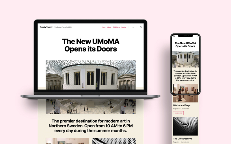
Twenty Twenty is the new default theme by WordPress which is expected along with the release of the latest WordPress version 5.3. Very much like its predecessor the Twenty Nineteen, it’s designed with a focus on Gutenberg. One huge difference between the two however is that the Twenty Twenty was designed on top of an already existing theme by the WP community.
Let’s take a closer look at the new Twenty Twenty theme, checking out the templates, function.php file and the stylesheet.
Quick Intro
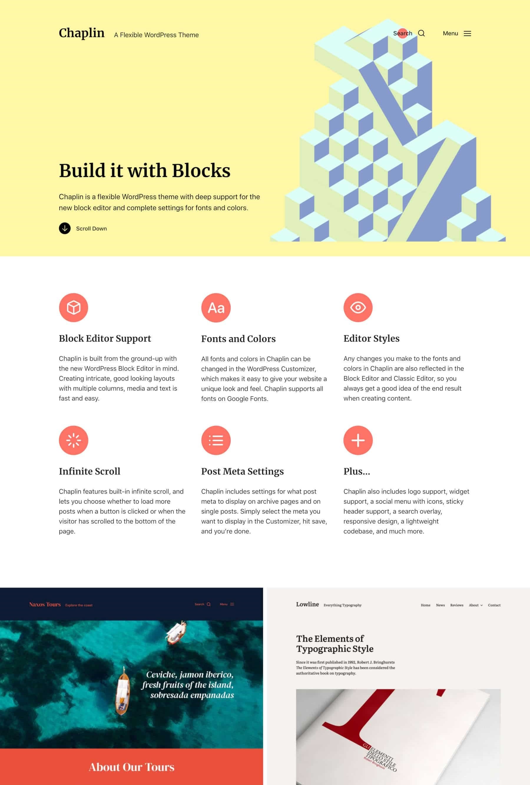
The theme was built upon Chaplin, which was made by Anders Noren, the man behind the design of the new WordPress 5.3.
The theme was created with the Block Editor in mind: flexible, clear, and readable are the key points considered.
Twenty Twenty gives designers and admins the option to create their custom layout in the Block Editor, as it comes with a column layout and three post/page templates. They have the freedom to use elements such as images, columns, and the group block which was introduces with Gutenberg 5.5.
Another new feature you will notice is the new typeface: Inter. It’s a free open source font family designed especially with readability of lower-case and mixed-case text, specifically with small font sizes.
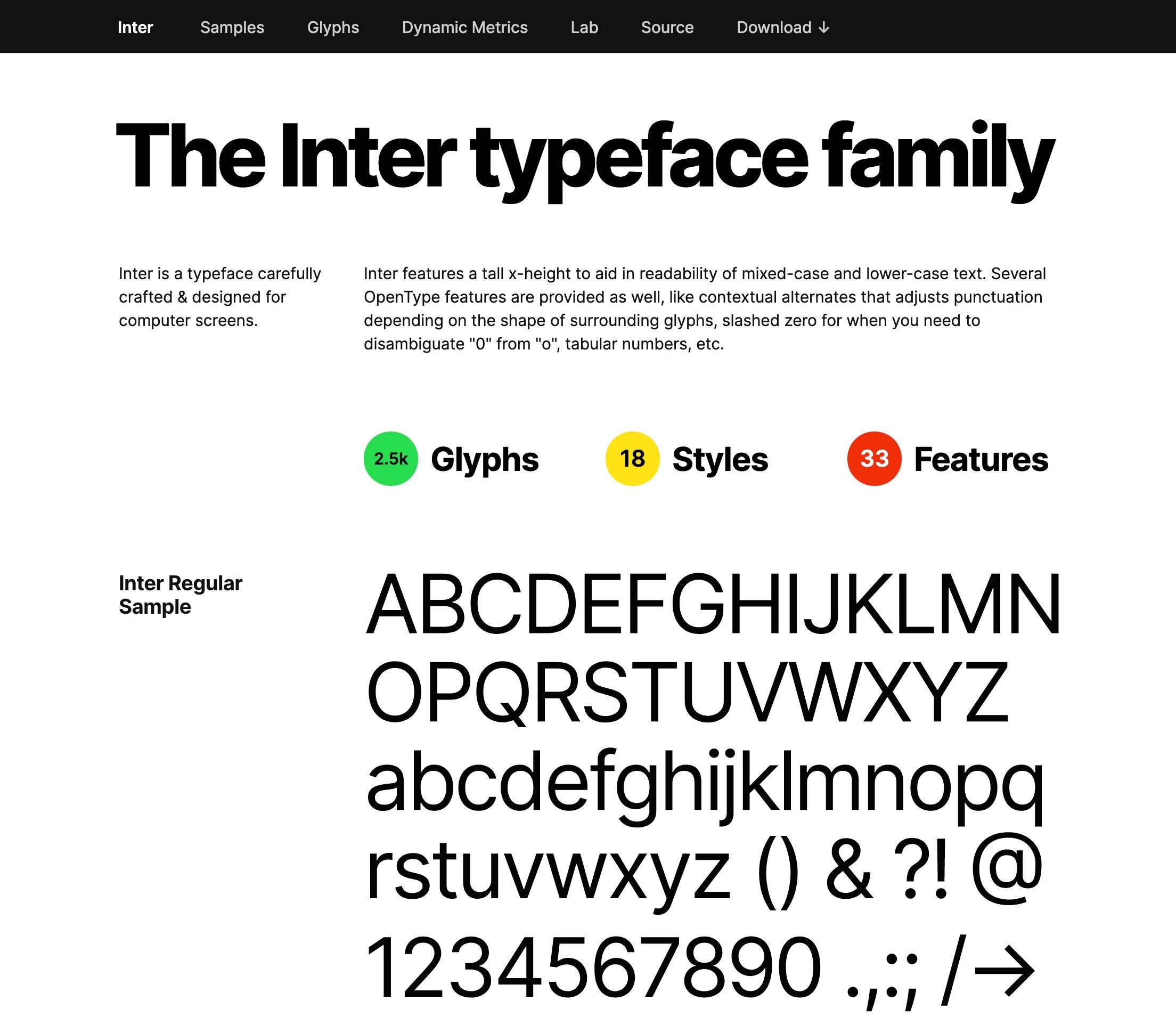
Big heathers look more presentable with Inter, but it’s also very useful with alternated text sizes, as you can see in the preview.
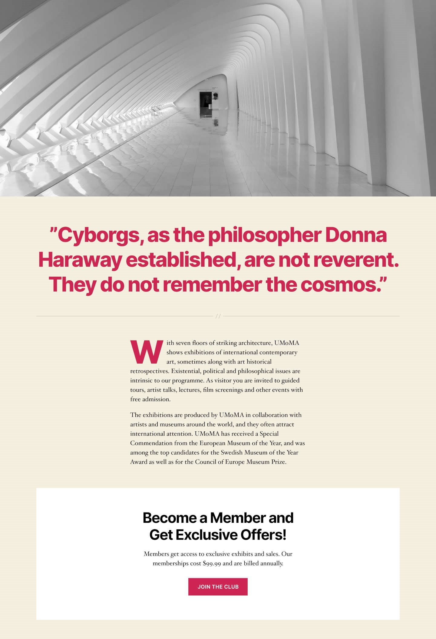
Twenty Twenty makes a very important new step towards editing UI. It relies on the Block Editor for laying and editing out the content.
Installation
Twenty Twenty will follow the release of WordPress 5.3. Meaning it’s still not available for download in the WordPress Theme Directory. However, you can still download the in-progress version of the theme on GitHub and install it in the current stable version of WP.
Simply follow these steps:
- Get the zip file from GitHub
- Upload it into the development installation in your Dashboard or with the help of SFTP.
- Browse to Appearance – Themes and click Activate.
- Go to Appearance – Themes to make the configuration.
That’s it, you are done!
You can start running tests on your local environment or your staging website.
Features
Unlike other full featured WordPress themes, Twenty Twenty is a minimal them, which gives admins and developers the freedom to build custom content for their website. Like the previous theme version, Twenty Twenty depends mostly on Gutenberg.
The theme has a variety of features such as content width, post thumbnails, automated feed links, title tag, as well as several HTML5 elements.
Some features add different options to the Theme Customizer such as custom logo or background. In the code bellow you can see these features enabled:
// Custom background color ;add_theme_support( 'custom-background', array( 'default-color' => 'F5EFE0' ) ); // Custom logo<add_theme_support( 'custom-logo', array( 'height' => 240, 'width' => 320, 'flex-height' => true, 'flex-width' => true, 'header-text' => array( 'site-title', 'site-description' ), ));
The theme supports some of Gutenberg’s very specific features such as wide and full-width alignments.
// Add support for full and wide align images.add_theme_support( 'align-wide' );
If you set an accent color in the Customizer, then the editor color palette is enabled:
// If we have accent colors, add them to the block editor paletteif ( $editor_color_palette ) { add_theme_support( 'editor-color-palette', $editor_color_palette );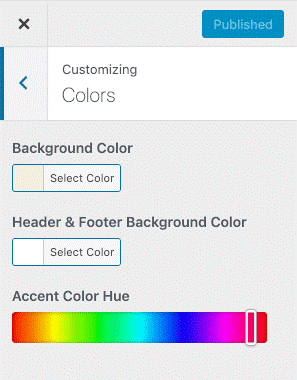
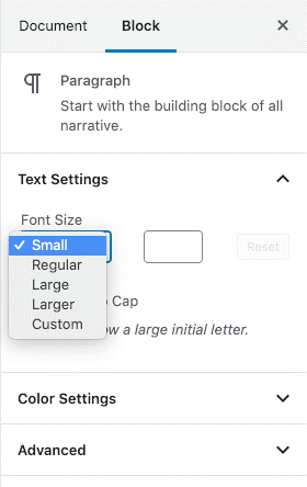
The Twenty Twenty theme comes in four available editor font sizes which you can find in the Block Editor.
// Gutenberg Font Sizesadd_theme_support( 'editor-font-sizes', array array 'name' => _x( 'Small', 'Name of the small font size in Gutenberg', 'twentytwenty' ), 'shortName' => _x( 'S', 'Short name of the small font size in the Gutenberg editor.', 'twentytwenty' ), 'size' => 16, 'slug' => 'small', ), array( 'name' => _x( 'Regular', 'Name of the regular font size in Gutenberg', 'twentytwenty' ), 'shortName' => _x( 'M', 'Short name of the regular font size in the Gutenberg editor.', 'twentytwenty' ), 'size' => 18, 'slug' => 'regular', ), array( 'name' => _x( 'Large', 'Name of the large font size in Gutenberg', 'twentytwenty' ), 'shortName' => _x( 'L', 'Short name of the large font size in the Gutenberg editor.', 'twentytwenty' ), 'size' => 24, 'slug' => 'large', ), array( 'name' => _x( 'Larger', 'Name of the larger font size in Gutenberg', 'twentytwenty' ), 'shortName' => _x( 'XL', 'Short name of the larger font size in the Gutenberg editor.', 'twentytwenty' ), 'size' => 32, 'slug' => 'larger', ), ) );
Customizing the Twenty Twenty theme
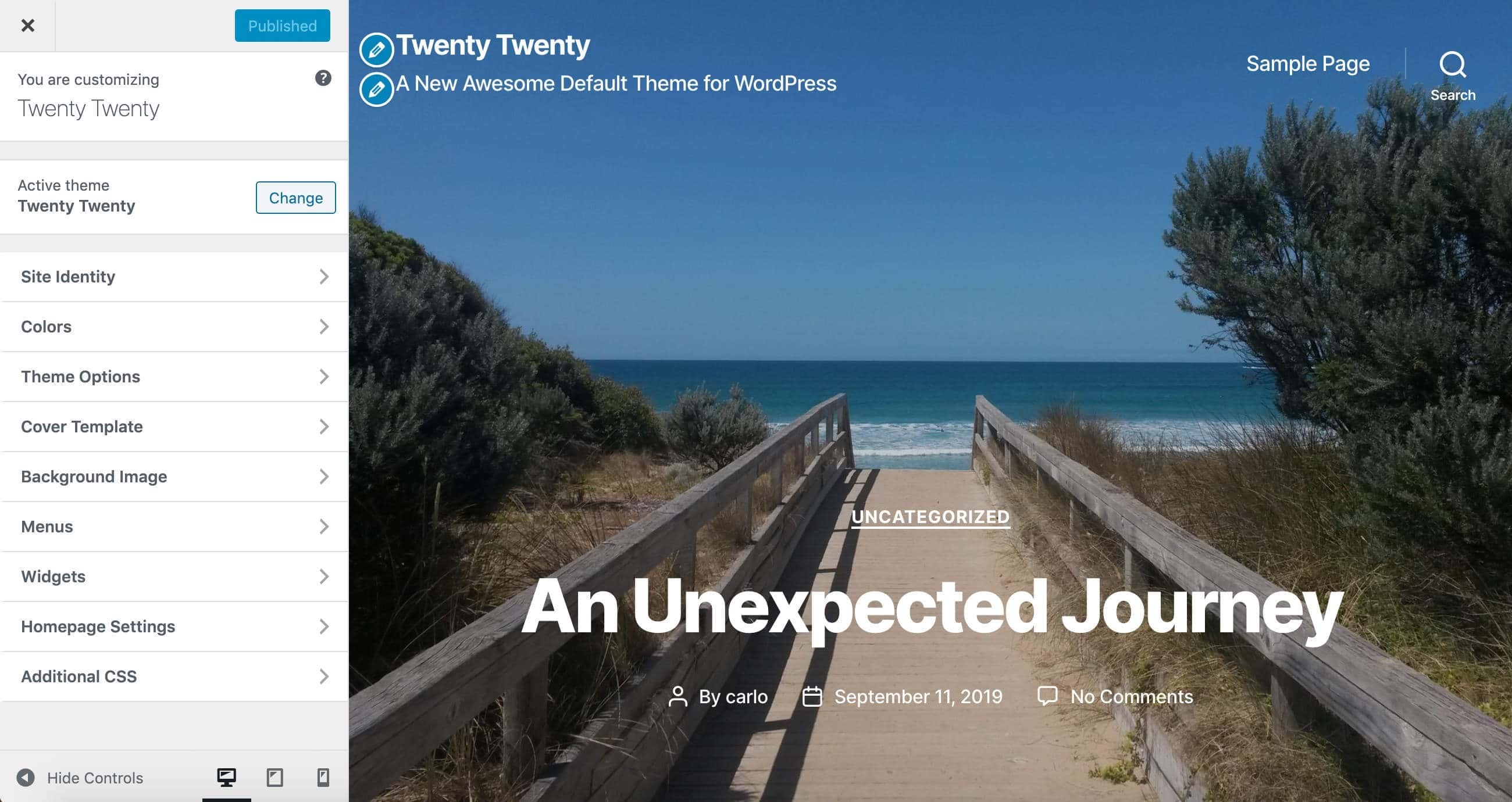
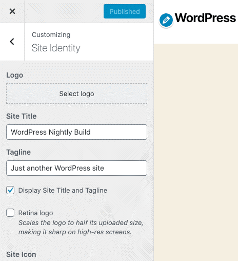
Twenty Twenty comes with a lot of flexibility in mind when used with Gutenberg. First you have the Site Identity which handles title and tagline, icon and logo. You can enable or disable these elements in the Site Identity tab:
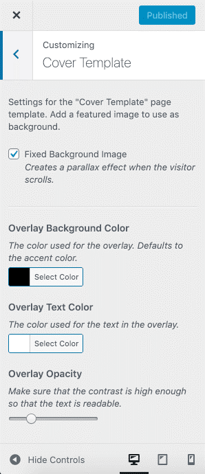
The Cover Template section is where you can manage the customization settings for the Cover Template page template. Once there, you can see:
- The option to enable a parallax effect for the background image
- Color option when setting your custom background and text color
- A slider which oversees overlay opacity.
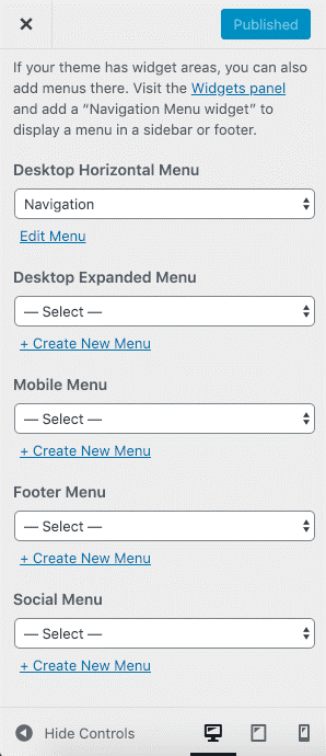
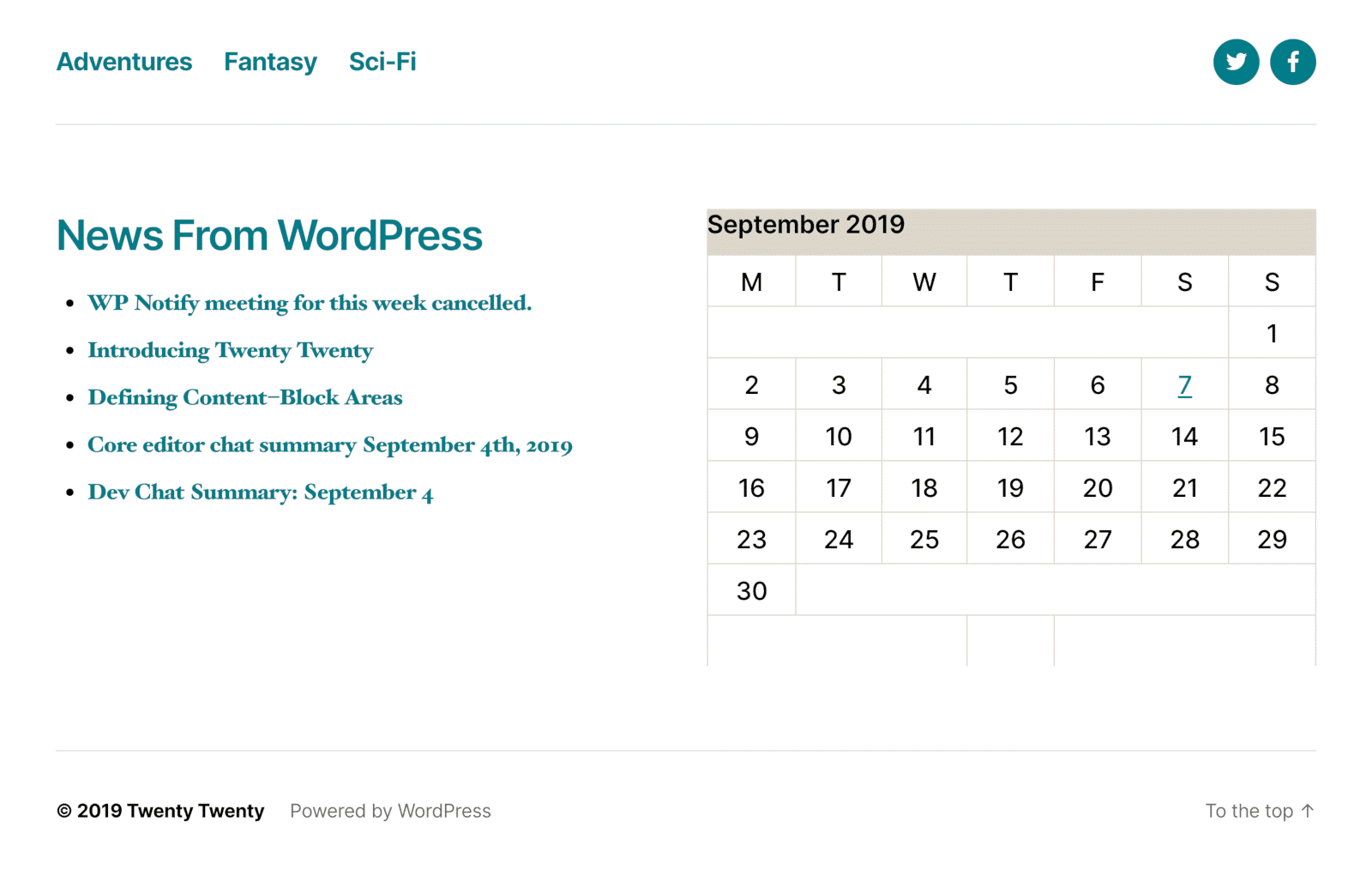
After this you have the Menu section. There are five options for menu locations: Desktop Horizontal Menu and Desktop Expanded Menu. The Mobile menu is designed only for mobile devices, and in the footer, you can find the Footer and Social Menus.
The footer handles two widget areas as well. In the image bellow you can see the footer with all elements included:
In the Additional CSS section, you can include your very own custom styles.
Post/Page Templates
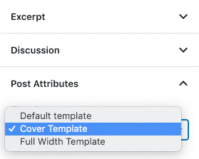
For the post/page layouts you have three options available. Aside from the default template, the theme provides you with a Full Width template and a Cover template which you can use to customize the look of your posted content.
The Block Editor
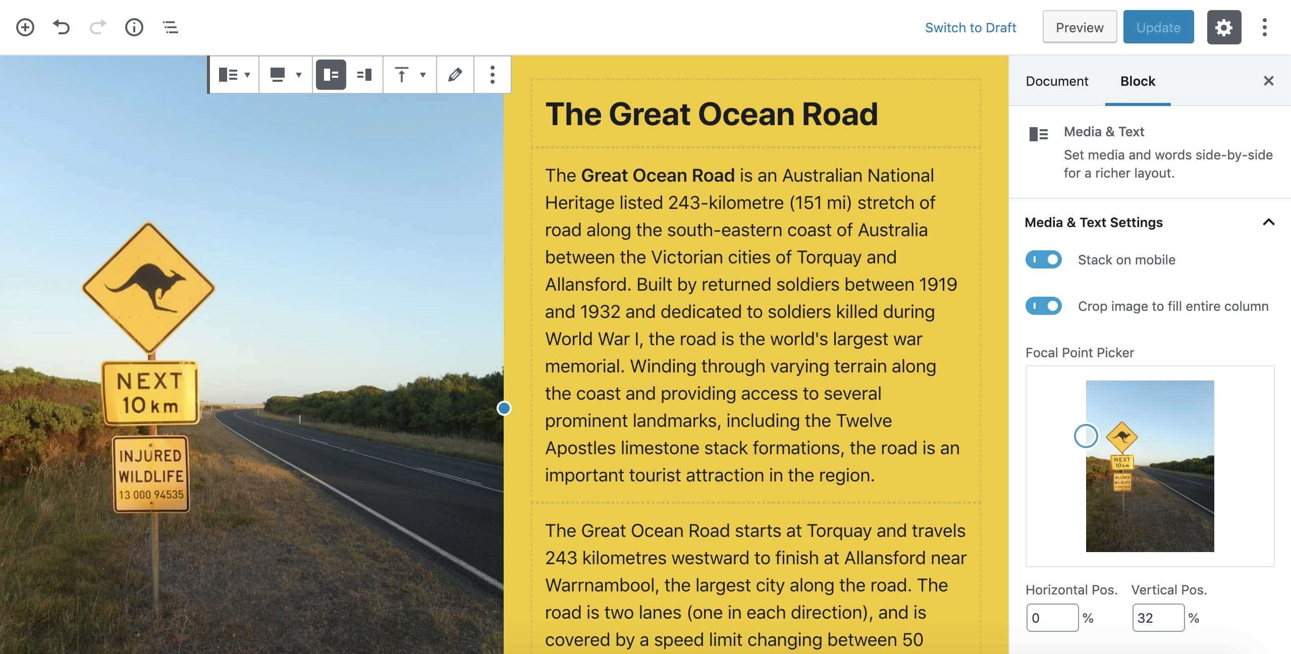
Due to the minimalistic design, the theme’s appearance relies mostly on the Block Editor. Some blocks prove very useful when building single page websites. Blocks such as Cover & Media and Text have been greatly improved for product presentation and portfolios:
As the theme is still a work in progress, make sure to check some of the available plugins which allow you to add extra blocks:
- CoBlocks
- Gutenberg Blocks
- Atomic Blocks
- Stackable
- Advanced Gutenberg
Conclusion
The new Twenty Twenty theme is a minimalistic WP theme, designed with a single column layout. Depending on the evolution of the Block Editor will determine how we use the theme. It aims to allows you to build websites without the need of code editing.
What is your experience with the Twenty Twenty theme? Share with us in the comments.

