A lot of people create website navigation more as an after-though after content and pages.
However, if most users can’t locate the content they are looking for on your website, then this is a major problem.
This can lead to increasing the bounce rate, lower time spend on the site and lower conversion rates.
What exactly is website navigation?
In short, this is the process of navigation though your website with the help of hyperlinks. A hyperlink is a type of link, leading your browser to a specific URL.
This URL gives indication which file the browser needs to access from the server, downloading and rendering the data so that it can be seen by the user.
Internal links will lead to different pages but on the same domain. External links will direct you to a different domain on an entirely different browser.
Site navigation uses menus with internal links, making it easier for users to see the page they are looking for. Good website navigation is essential for any website.
Why is navigation so important for a website?
Nearly 50% of users are not able to find what they are looking for on a standard website menu. Just imagine how few people are actually able to come across the desired content.
You can, however significantly lower that percentage, which will reduce your bounce rate, lead to more traffic and new customers.
Types of site navigation
There are three main types:
- Global navigation
- Hierarchical navigation
- Local navigation
When you combine them correctly, they will assist visitors when they visit your site and find the content they are looking for.
How to improve website navigation?
No matter if you are still a beginner at creating a website, just follow the tips bellow and you will nail your website navigation.
1. Plan the website navigation and structure
Prior to start creating content, make sure to plan out how the website structure is supposed to look like.
This is an essential step in the process of providing users with a great experience. You can even use a sitemap creator for a quick mockup for how you want the site to look like.
2. Follow the already established standards
No need to be too creative here, just stick to the basics.
Follow the known standards when it comes to design elements. One of the most recognizable icons for the menu are the three horizontal stripes and the three dots creating a horizontal line.
If you decide to make a custom menu icon, this might confuse the visitors and they will not be able to locate the menu themselves.
3. Use user vocabulary
It’s better to use a language your users are used to instead of simply linking the same old pages.
This will benefit both your usability and SEO. Your pages need to reflect on what your visitors are searching online.
4. Responsive menus
Since most traffic is now mobile (over 52%), responsive design is an absolute must.
Implement more expandable menus instead of such which are out of the frame of your mobile browser. Horizontal menus are harder to click on or read.
The good news is, all of the best WP themes have responsive design by default.
5. Use the Footer menu
Unlike most users, readers are far more engaged with your content and are constantly reading and scrolling down. Take advantage of this fact, and use the bottom of the page to include valuable content.
You can include essential pages such as company info, articles or categories.
You can highlight the content which doesn’t fit into the header.
6. Separate navigation by using color and white space
Separate your menus from the main content with the help of white space, fonts and colours. Define clearly where the navigation starts and ends.
If users are unable to find the menu, then it will not matter what language or colours you are using.
7. Stay away from dropdown menus
For a lot of websites, dropdown menus are far from useful. Every time a user sees a link, they naturally assume it’s clickable. Unless it’s separated by the design, it can be a bit confusing.
There can be a negative impact on navigation if there are too many links in the main menu.
8. Flatten the structure
In order to make it easy and user friendly for visitors, keep a flat navigation structure as possible.
Keep it simple by linking the more significant categories from the Home page to a single layer of sub-category or even single article pages.
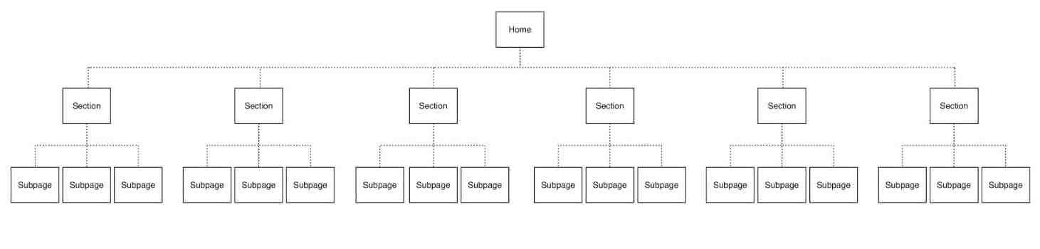
This will have great impact to your SEO and can lead to Google sitelinks. So don’t make your site structure too messy!
Conclusion
We hope you now have a better understanding of that website navigation is and its key points.
It should always focus on clarity and simplicity rather than bright colours and a more creative design. As you need to take into account mobile and desktop users alike, it would probably be a good idea to hire a developer.
Good usability and better clarity are priorities when it comes to website navigation. If you create a structure which makes sense to your visitors, then your site will attract more and more users.
We hope this article was helpful. We would like to hear your experience with website navigation, what type is your site relaying on and how your users reacted?